Some spaces exude a sense of effortless beauty—where every tile, texture, and tone flows in perfect harmony. Others might feel off, even when all the colors seem to "match." That disconnect often stems from undertones, the subtle hue beneath a tile’s dominant color that can make or break a room’s cohesion.
What Is an Undertone?
An undertone is the quiet influence beneath a tile’s surface color. It might be a hint of gold in a beige, a whisper of blue in a gray, or a soft blush beneath a brown. These nuances shape how colors interact, determining whether a space feels grounded and cozy or cool and refined.
When undertones compete—say, a taupe with a pink undertone paired with a beige leaning yellow—the result can feel unsettling. But when they align or intentionally contrast with balance, the outcome is stunningly stylish.
Warm and Cool Undertones: Understanding the Difference
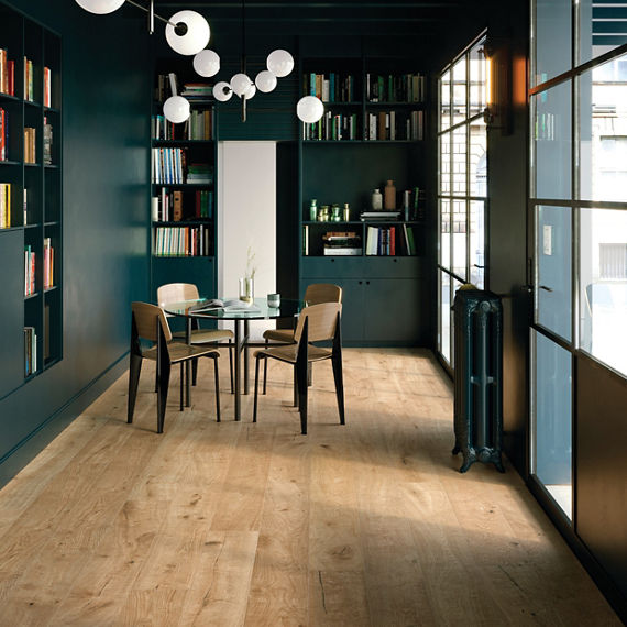
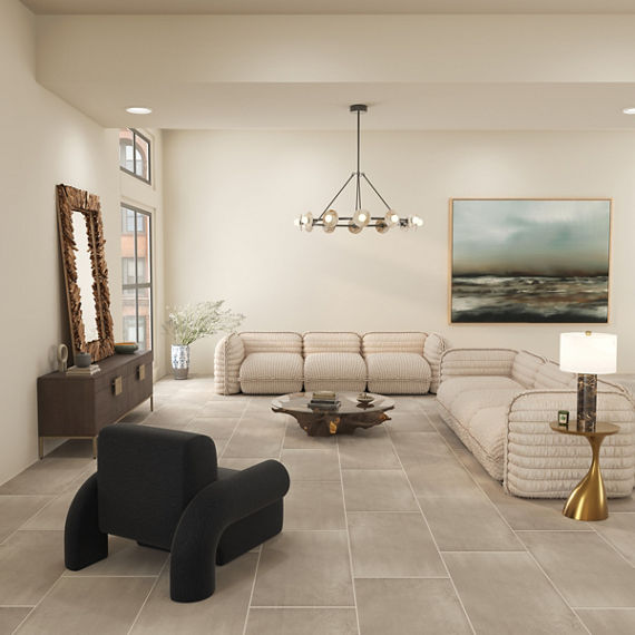
Warm undertones bring a sense of comfort and richness. Think inviting honeyed woods, earthy clays, and sun-baked tones. A standout in this category is the Treverksoul series, a glazed porcelain wood look tile inspired by antique parquet floors. It combines the elegance of chevron shapes with rich tones like the Neutral and Brown colors, both delivering warmth with timeless character.
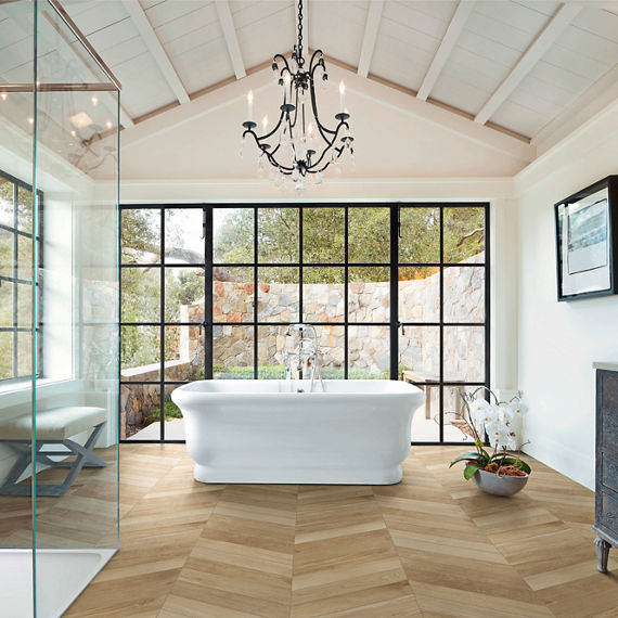
Another wood-look standout, the Vero series, captures the beauty of natural oak in porcelain. Its extra-long planks in shades like Castagno and Natural offer a soft, aged warmth that elevates rustic and contemporary spaces alike. The American Estates series rounds out the warm wood category with heritage-inspired colors such as Saddle, Natural, and Spice, each glowing with amber and red undertones.
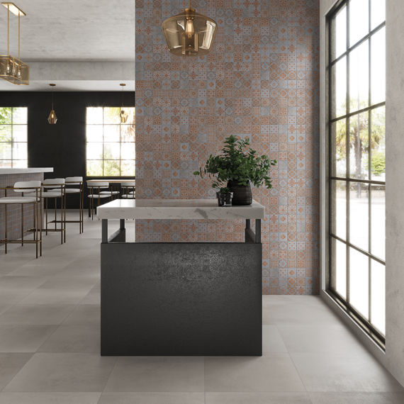
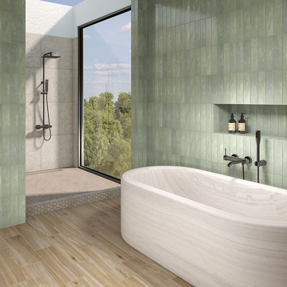
Warmth isn’t limited to floors. Wall tile like those from the Costa Clara series—glossy, handmade-inspired ceramic in hues like Beach Sand and Pelican—channel artisanal charm with a breezy, sun kissed vibe. The Zellige Neo series continues that story with tones like Lana, a creamy glazed beige, and Salvia, a golden-sage green, both adding an earthy layer to vertical spaces.
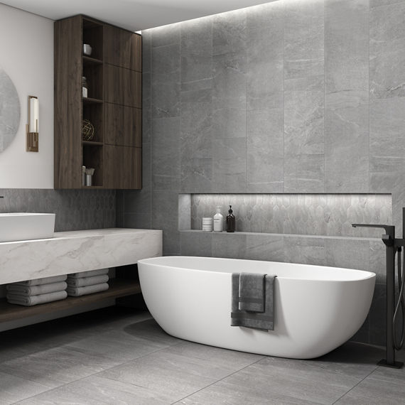
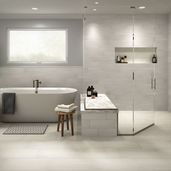
On the other end of the spectrum, cool undertones provide serenity and a modern edge. The Marble Obsession series captures this balance beautifully with refined marble look options in colors like Grigio, a soft, elegant gray with a cool undertone, and Arabescato, a white base veined with delicate blue-gray striations. Both offer crisp sophistication and timeless appeal—ideal for creating serene, style-forward spaces.
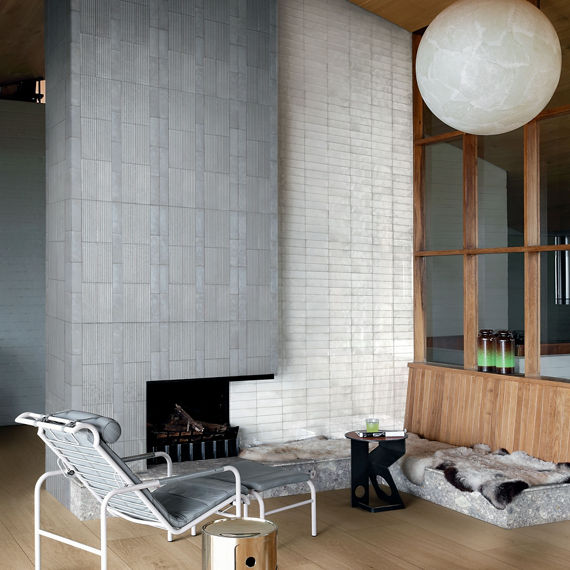
Cool hues also appear in the Zellige Neo series, with tones like China, a saturated navy; Gesso, a chalky soft white; and Cielo, a misty blue-gray—each one designed to bring calm sophistication to the foreground. The Artistic Reflections series, a glazed ceramic wall tile line, adds another layer of cool with colors like Rain, Haze, and Twilight, all with handcrafted sheen and depth.
Why Undertones Shape the Mood
Undertones are the emotional current beneath a color. Warm undertones tend to envelop a space in comfort—perfect for living areas, kitchens, and bedrooms.
Cool undertones evoke clarity and calm, often ideal in bathrooms, entryways, or spaces you want to feel expansive.
But it’s not just about warm versus cool. It’s about what those tones do together. Get it right, and you create a rhythm that carries through every inch of a room. Get it wrong, and things feel disjointed no matter how expensive the materials.
How to Pair Warm and Cool Undertones
Or keep things crisp by combining Bleu from Savoir with Rice Blu Deco Leaf for a sophisticated cool-tone escape.

Pay close attention to materials and finishes. Glossy surfaces can intensify cool undertones, while matte finishes tend to reinforce warmth. And lighting? It’s everything. North-facing rooms often pull cooler, while afternoon light makes warm tones pop. Always test samples in your actual space to see how they perform.
Editorial-Level Style, Made Simple
Mastering undertones is less about memorizing rules and more about
reading the room. Whether it’s the heirloom character of Treverksoul, the
expressive luxury of Savoir, or the handcrafted glow of Costa Clara, there’s a
palette that speaks to your vision.
Explore contrasts. Layer depth. Combine finishes. It’s all part of the art.
Ready to bring it to life? Use the Stylizer to experiment with warm and cool pairings in your own space. Or stop by a showroom to see each color react under real-world lighting.