

Color drenching with tile is a design principle where a space is saturated using a single hue, translated it into a more tactile approach to monochromatic tile design. Instead of relying on paint to unify a room, it commits to one color executed materially, carrying that theme across walls, floors, and every surface in the room. When it comes to color drenching, the final result depends less on the color itself and more on how different aspects of tile are handled within it.
Adding Dimension to a Room with Texture

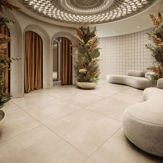
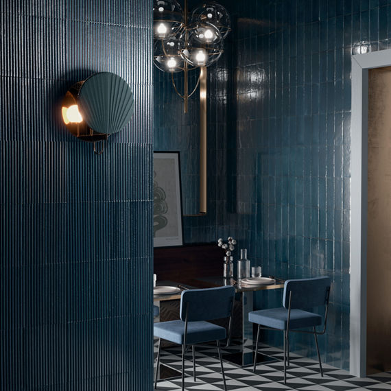
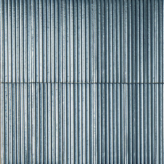
Textured tile can elevate a single-color room without making it feel crowded. A fluted or dimensional wall tile catches light differently than a smooth floor tile in the same shade, giving a monochromatic room the depth that paint alone isn’t able to replicate.
Crafthouse illustrates this with particular clarity. Pairing its fluted wall tile with a floor tile in the same hue lets light and shadow interact, letting texture communicate the transition between different surfaces.
With a series like Terramater, tile can bring a comparable sensibility to wall applications. Its glossy, dimensional surface offers the kind of textured wall tile that a flat, single-color room often lacks. Available in a selection of neutral colors, it can be paired with a similar floor tile for a contiguous aesthetic.

Using Scale to Break Up Color
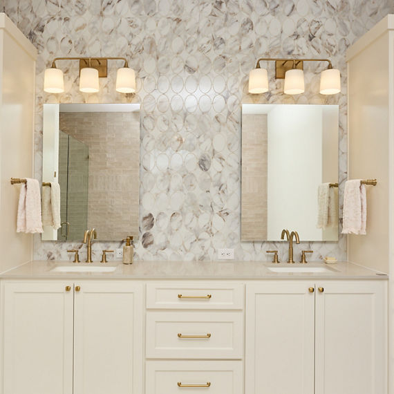
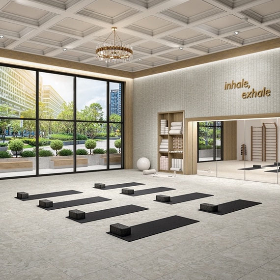
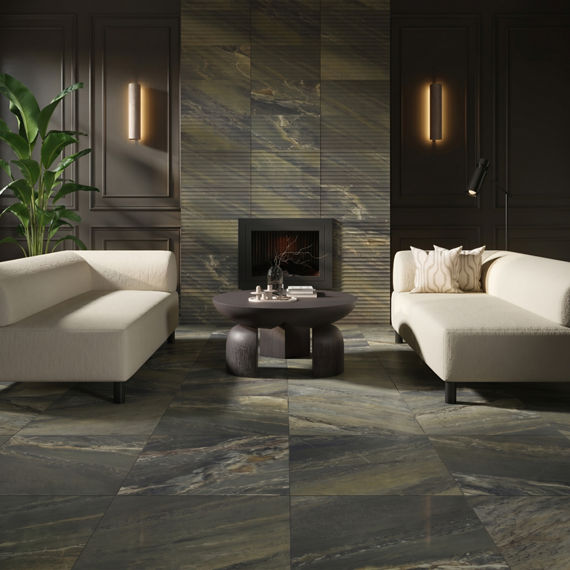
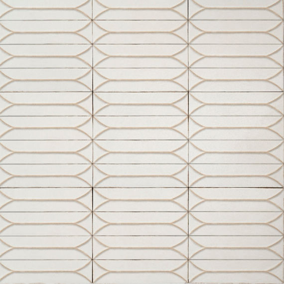
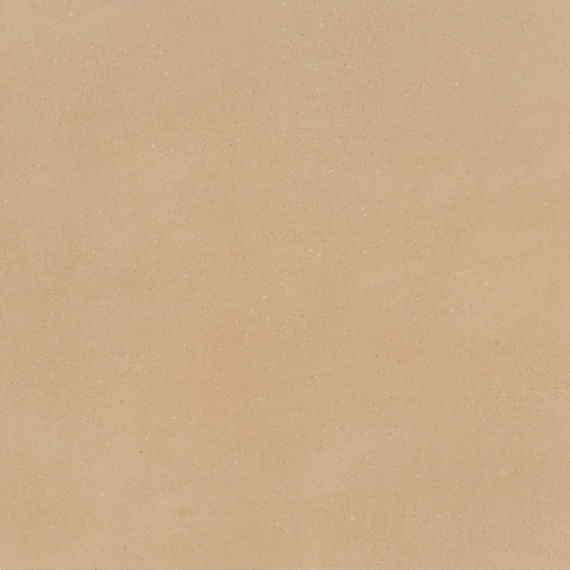
When it comes to color drenching with tile, scale does the work that color alone cannot. Pairing a large-format floor tile with a smaller wall tile or mosaic accent will break up a monochromatic room's visual weight and help define separate zones within a space.
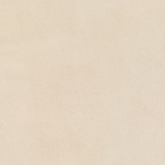
Forgehaus offers a compelling study in scale. Its large-format floor tile commands a room on its own, while smaller coordinating formats introduce variation on walls and floors alike within the same neutral palette.
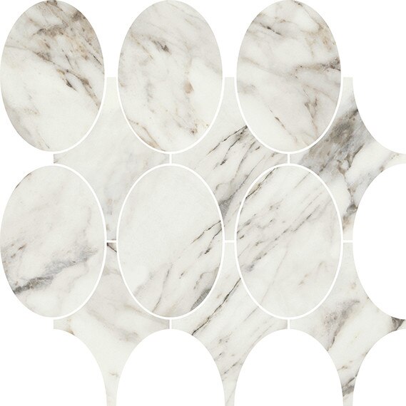
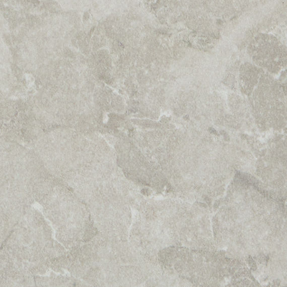
With Editorial, tile extends the same principle in an upscale marble look. Layering a large-format floor tile beneath a smaller fluted wall tile or mosaic accent allows a single featured color to feel intentional at every scale and let the rich veining take center stage.

Varying Tile Layout Without a Second Color
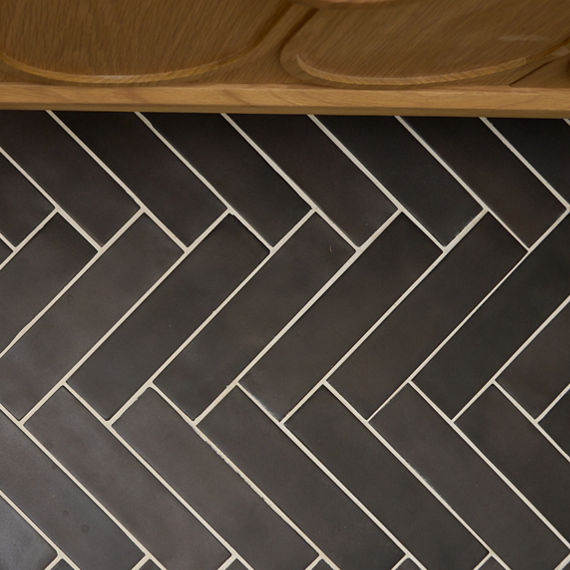
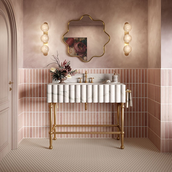

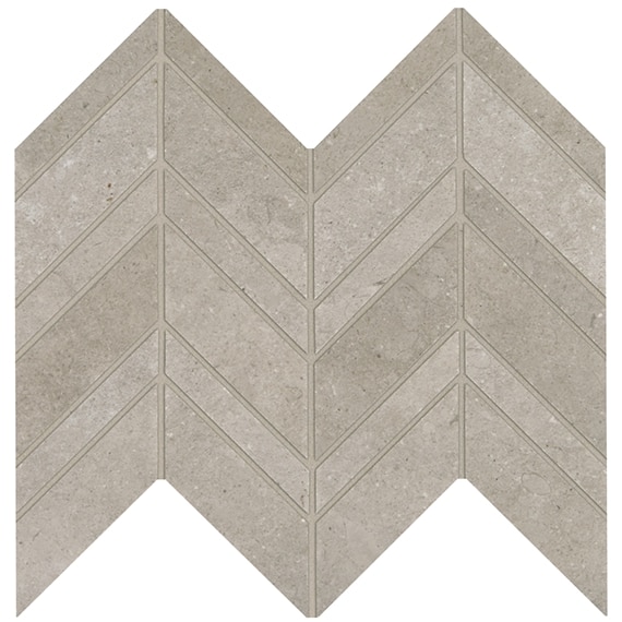
Installation pattern is one of the easiest ways to create a cohesive space without introducing a second color, since varying how a tile is installed can add visual interest in a color-drenched room. A herringbone or hexagon layout draws the eye in a way a straight-set installation can't, adding rhythm to a room without deviating from the chosen hue.
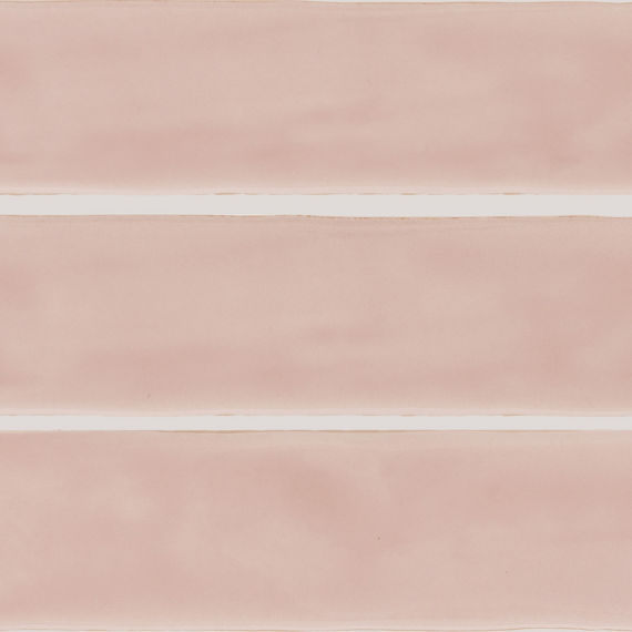
Artistic Reflections is particularly well suited to this approach. Its elongated format invites a range of installation patterns, while a coordinating mosaic introduces geometric detailing.
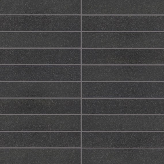
Inyo offers a similarly versatile foundation, its range of formats each suited to a different installation approach, giving its crackled, leathered finish the room to read differently depending on how it's laid.
Master Color Drenching with the Right Tile
At its core, color drenching is a commitment to a single color carried fully across a space, and texture, tile size, and tile layout are what keep that commitment from feeling monotonous. Together, they can give a monochromatic space the depth and intention it demands.
Need inspiration? Design your perfect space using the Stylizer™ tool.
Dare to be Bold™ with Marazzi. Browse our full collection of tile series or find a showroom near you.