

Some colors save their finest hour for when the lights go low. Moody neutrals take the calm palette of beige and gray and pull it toward midnight tones for a space that reads as refined yet relaxed. With moody neutral tile, the drama lives in the way shade and light move across each surface, giving quiet color the depth to hold a room.
Layer Neutral Shades from Soft to Deep

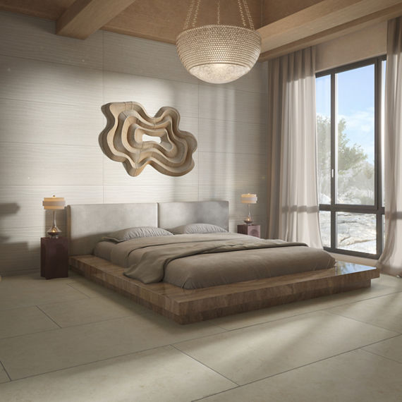
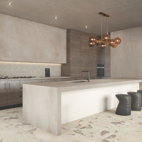
A moody color scheme has depth when it moves through a full range of shade. Softer beige tones can be a gentle entry point for deep browns and blacks to anchor a space.
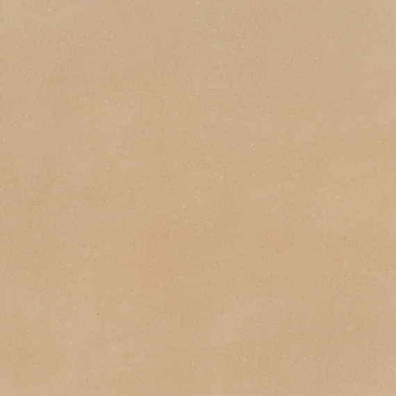
To explore the softer end of the range, look to Crafthouse™ and Materika™, where concrete look tile in brown neutrals and large-scale wall tile in subdued mineral tones can lay a foundation. With Illusionist™ you can go further, integrating neutrals across varying shades of brown and black. By pairing neighboring shades of tile, the darkest tone can arrive gradually.
For help matching warm and cool shades, please see our guide to understanding undertones.

Use Light to Deepen a Room
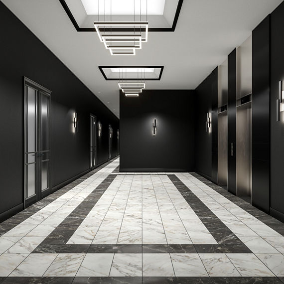
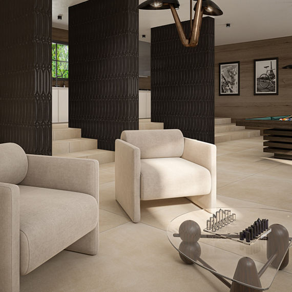
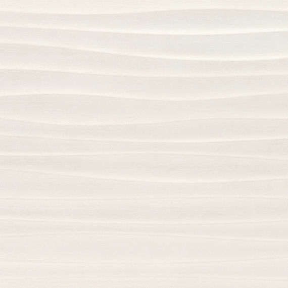
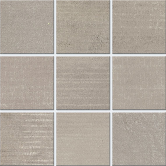
Light can shape the mood of a room as much as color does. Polished and glossy finishes will carry light through the space so deep tones stay luminous, while matte finishes can provide a soft, velvety effect. Commercial interiors have room for this drama too, and a conference hall or a convention center in layered, dark tones can feel inviting and spacious when finish and light work together.
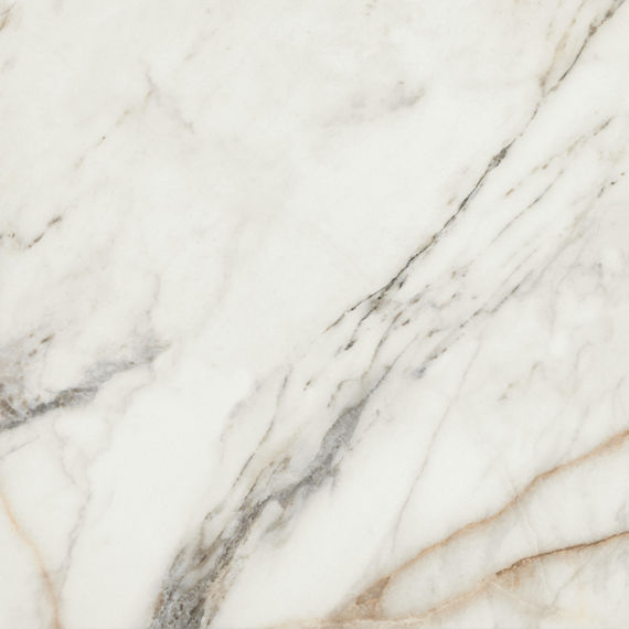
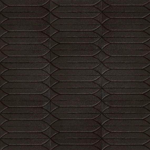
Savoir™ serves as a natural starting point, with marble look tile offered in a matte or a polished surface. For glossy dimension on a backsplash or feature wall, Terramater™ provides a subway tile with slightly irregular edges and a high-gloss glaze that scatters the light.
Add Warmth to Tile with Wood Grain
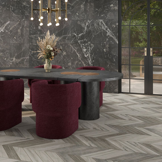

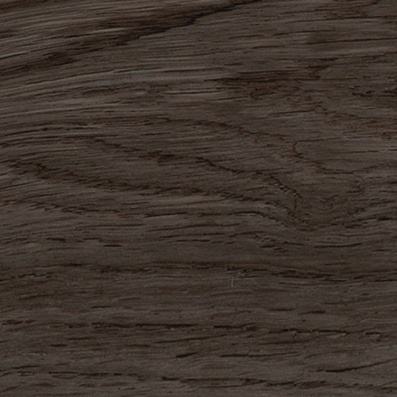
Treverksoul™ takes its cue from parquet of a bygone age, with cooler tones that can make a smoky backdrop for a distinct chevron layout. Vero™ takes a softer route, with planks that recall aged oak in warm shades of brown.


Consider Pattern with a Handcrafted Edge
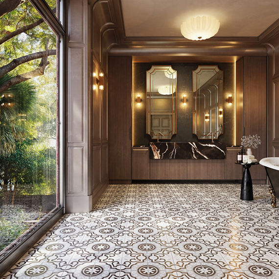
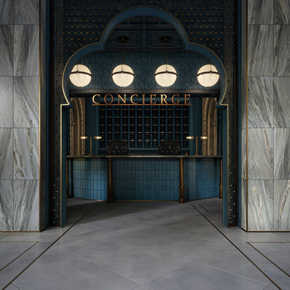
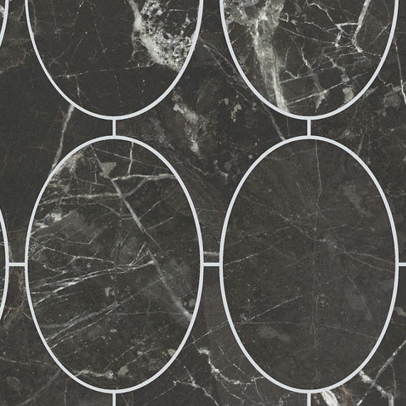
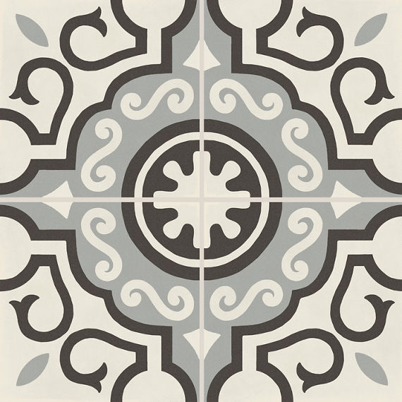
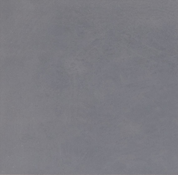
D_Segni™ revisits retro-inspired patterned tile, with graphic motifs that sit comfortably alongside the surrounding shades. Moroccan Concrete™ offers an earthier take, with concrete look tile in faded neutral colors and patterned tile in traditional Moroccan motifs.
Building a Moody Neutral Space, One Tile at a Time
Like the hour when the lights go low, a moody neutral space keeps changing as the day moves along, and that is where its appeal lives. In a private home or a hardworking commercial space, the look invites people to linger, so every layer in the mix gets its moment.
Ready to test a darker palette? Preview dark neutral tile in your own space with the Stylizer™ tool.
Dare to be Bold™ with Marazzi. Browse the dark and moody tile guide or visit a showroom near you.